
The Importance of Mobile-First Design
In today's digital landscape, mobile devices have become the primary means through which people access the internet. According to recent statistics, mobile devices account for approximately 60% of global website traffic, with this percentage continuing to rise year over year. This shift has fundamentally changed how websites should be designed and developed.
The Evolution to Mobile-First
Historically, websites were designed for desktop computers first, with mobile considerations being an afterthought. Designers would create the full desktop experience and then strip away elements to make a simplified mobile version. This approach, known as 'graceful degradation,' often resulted in compromised mobile experiences.
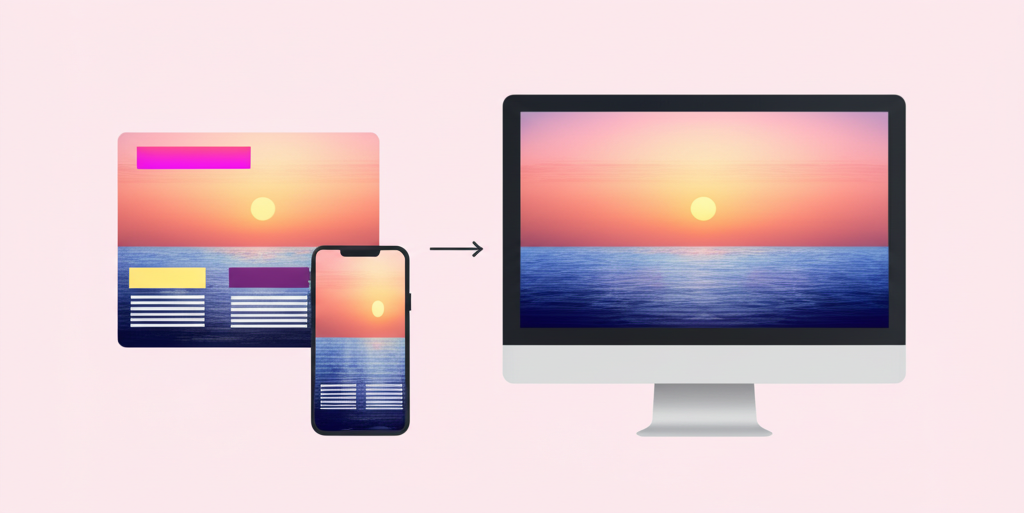
Mobile-first design flips this paradigm. It starts with designing for the smallest screen first and then progressively enhances the experience for larger screens. This approach, called 'progressive enhancement,' ensures that the core experience is optimized for mobile users before adding complexity for desktop users.
Why Mobile-First Matters
1. Alignment with User Behavior
The most compelling reason for mobile-first design is simply that it aligns with how people use the internet. For many businesses, especially in e-commerce, social media, and local services, mobile traffic significantly exceeds desktop traffic. Designing primarily for desktop means designing primarily for a minority of your users.
2. Search Engine Rankings
Google has implemented mobile-first indexing, meaning it predominantly uses the mobile version of a site's content for indexing and ranking. Sites that aren't mobile-friendly or that provide a poor mobile experience are likely to see negative impacts on their search rankings, regardless of how well they perform on desktop.
3. Forced Prioritization
Mobile-first design requires ruthless prioritization of content and features due to limited screen space. This constraint actually benefits the overall user experience by forcing designers to focus on what truly matters. When you start with mobile, you're compelled to identify and emphasize your core value proposition and most critical user paths.
4. Performance Optimization
Mobile devices often connect to the internet through cellular networks with varying speeds and reliability. Mobile-first design naturally emphasizes performance optimization, including faster load times, reduced data usage, and efficient code. These optimizations benefit all users, regardless of device.
5. Future-Proofing
The line between mobile and desktop continues to blur with the proliferation of devices like tablets, foldable phones, and touchscreen laptops. A mobile-first approach creates flexible designs that can adapt to this evolving ecosystem of devices and screen sizes.
Key Principles of Mobile-First Design
Content Prioritization
Mobile-first design begins with identifying the most important content and functionality. What do users absolutely need to accomplish their goals? This content should be immediately accessible, while secondary information can be progressively disclosed as needed.
Touch-Friendly Interfaces
Mobile interfaces are navigated primarily through touch rather than mouse pointers. This requires larger touch targets (ideally at least 44×44 pixels), appropriate spacing between interactive elements, and consideration of thumb zones (areas easily reached when holding a phone).
Simplified Navigation
Limited screen space means rethinking navigation patterns. Mobile-first designs often employ hamburger menus, bottom navigation bars, or progressive disclosure techniques to maintain usability without consuming valuable screen real estate.
Performance Budgets
Mobile-first design includes strict performance budgets for page size, load time, and number of requests. Every design decision should be weighed against its performance impact, with a focus on delivering the fastest possible experience.
Responsive Images and Media
Images and videos should adapt to different screen sizes and resolutions. This includes using responsive image techniques, appropriate compression, and considering whether certain media elements are necessary for the mobile experience.
Common Challenges and Solutions
Complex Functionality
Some websites require complex functionality that's challenging to implement on mobile. The solution isn't to eliminate this functionality but to reimagine how it can work within mobile constraints. This might involve breaking complex processes into steps, using progressive disclosure, or creating mobile-specific interaction patterns.
Content Parity
Mobile-first doesn't mean mobile-only. Users should have access to the same content and features regardless of device, though the presentation may differ. Hiding content from mobile users creates a fragmented experience and can negatively impact SEO.
Testing Complexity
The diversity of mobile devices makes testing more complex. Establish a testing strategy that covers various device types, screen sizes, and operating systems. Automated testing tools and device labs can help manage this complexity.
Implementing Mobile-First Design
Start with Content Strategy
Before designing interfaces, develop a content strategy that identifies core messages and functionality. This becomes the foundation for your mobile design, ensuring that the most important elements receive priority.
Use Responsive Frameworks
Frameworks like Bootstrap, Foundation, or Tailwind CSS provide responsive grid systems and components that facilitate mobile-first development. These tools help create flexible layouts that adapt to different screen sizes.
Design in Iterations
Begin with mobile wireframes and prototypes, test with users, and refine before expanding to larger screens. Each iteration should maintain the core experience while taking advantage of additional screen space.
Continuous Testing
Regularly test your designs on actual mobile devices, not just emulators or responsive browser windows. Pay attention to performance metrics, touch interactions, and how the design works in real-world conditions like poor lighting or one-handed use.
Conclusion
Mobile-first design is no longer a trend or a nice-to-have—it's a fundamental approach that reflects how people use the internet today. By prioritizing the mobile experience, businesses not only serve the majority of their users better but also create more focused, efficient, and future-proof digital products.
Responsive Website Development
Our development team specializes in creating responsive, mobile-first websites that provide an optimal experience across all devices while maintaining brand consistency.
Ready to implement these strategies?
Our team of experts can help you apply these insights to your business and achieve measurable results.
Stay Updated with Industry Insights
Subscribe to our newsletter to receive the latest trends, tips, and strategies.
Related Articles
5 Web Design Trends to Watch in 2023
Discover the latest web design trends that are shaping the digital landscape in 2023 and beyond.

How to Improve Your Website's SEO in 10 Steps
Learn practical steps to boost your website's search engine rankings and drive more organic traffic.

Building a Strong Brand Identity Online
Discover how to create a consistent and compelling brand identity across all your digital channels.
About the Author
Wilton Otto
Content specialist at WilGlobo Digital Services with expertise in mobile and digital marketing strategies.